The digital landscape in Azerbaijan is undergoing a significant transformation as web development professionals increasingly embrace mobile-first design methodologies. This shift represents more than just a technical adjustment—it reflects a fundamental change in how businesses and organizations approach their online presence in an increasingly mobile-connected world.

The Mobile-First Revolution
Web development agencies across Azerbaijan are reporting a dramatic increase in client demand for mobile-optimized websites. According to recent industry surveys, over 70% of new website projects now prioritize responsive layouts and touch-friendly interfaces from the initial design phase. This represents a complete reversal from just five years ago, when mobile optimization was often treated as an afterthought or secondary consideration.
The driving force behind this transformation is clear: smartphone usage in Azerbaijan has reached unprecedented levels. With mobile devices now serving as the primary gateway to the internet for millions of users, businesses can no longer afford to treat mobile experiences as secondary to desktop versions. The consequences of neglecting mobile users are immediate and measurable—higher bounce rates, lower engagement, and ultimately, lost opportunities.
of new website projects in Azerbaijan now prioritize responsive layouts and mobile-first design approaches, reflecting the fundamental shift in user behavior and digital consumption patterns.
Key Design Principles Gaining Traction
Local web development teams are implementing several core principles that define modern responsive design. These approaches ensure that websites deliver optimal experiences regardless of the device or screen size being used.
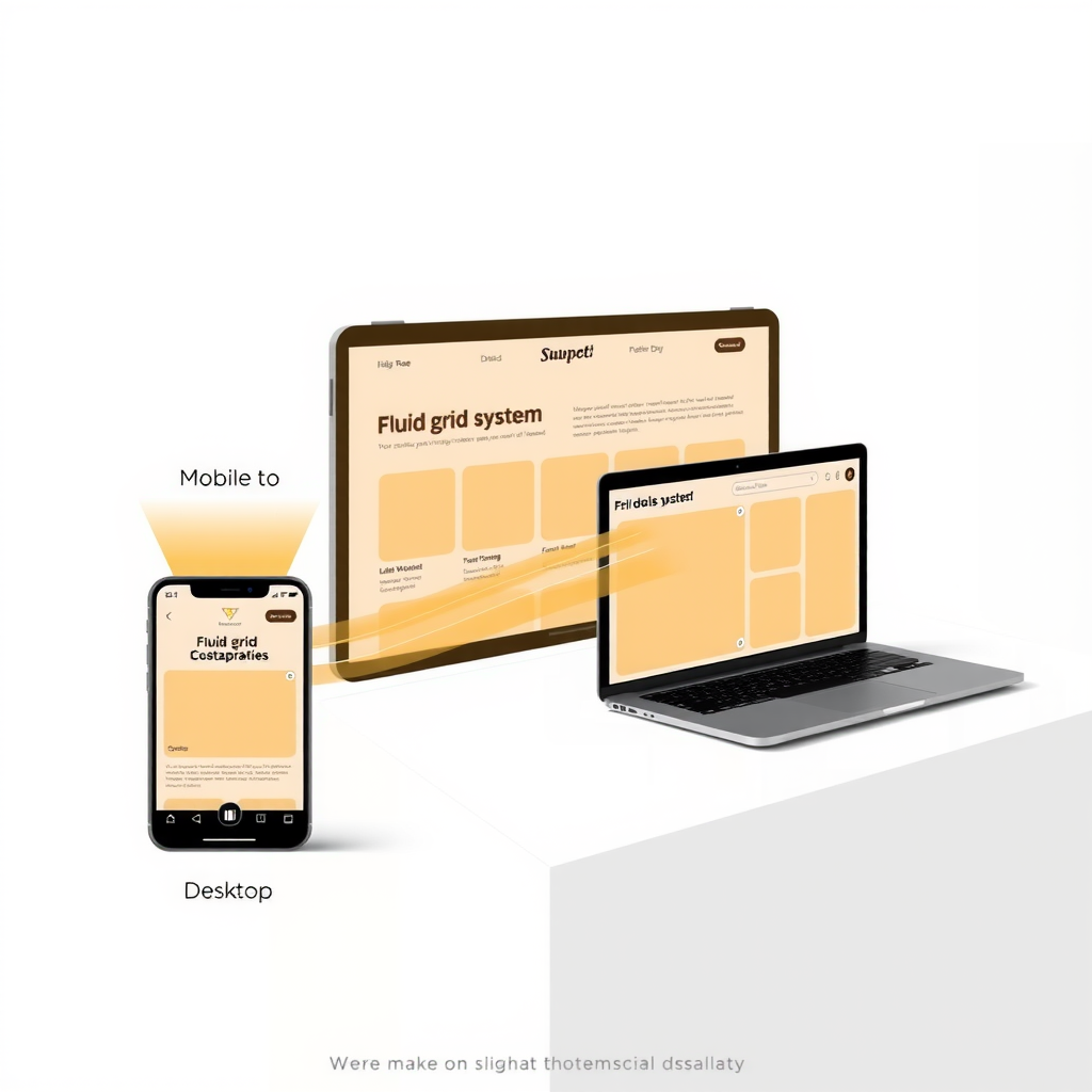
Fluid Grid Systems
Rather than designing fixed-width layouts, developers are creating flexible grid systems that automatically adjust to different screen sizes. This approach uses relative units like percentages instead of fixed pixels, allowing content to flow naturally across various devices. The result is a seamless experience that feels native to each platform, whether viewed on a smartphone, tablet, or desktop computer.
Touch-Optimized Interfaces
Recognizing that mobile users interact with websites through touch rather than mouse clicks, designers are creating larger, more accessible interactive elements. Buttons and links are sized appropriately for finger taps, with adequate spacing to prevent accidental clicks. Navigation menus are being redesigned with mobile gestures in mind, incorporating swipe actions and collapsible sections that work intuitively on touchscreens.
Performance Optimization
Mobile users often access websites over cellular networks with varying connection speeds. Azerbaijan's web development community has responded by prioritizing performance optimization techniques. This includes implementing lazy loading for images, minimizing code bloat, and using modern compression techniques to ensure fast loading times even on slower connections. The focus on performance isn't just about user experience—it also impacts search engine rankings, as platforms like Google increasingly prioritize mobile page speed in their algorithms.
Impact on User Behavior and Business Outcomes
The adoption of responsive design principles is yielding measurable results for businesses across Azerbaijan. Companies that have invested in mobile-first redesigns report significant improvements in key metrics. Average session durations have increased as users find it easier to navigate and consume content on their preferred devices. Bounce rates have decreased, indicating that visitors are more likely to engage with properly optimized sites rather than immediately leaving in frustration.
E-commerce platforms have seen particularly dramatic improvements. Mobile-optimized checkout processes have reduced cart abandonment rates, while touch-friendly product galleries have increased engagement with product catalogs. For service-based businesses, mobile-responsive contact forms and click-to-call buttons have streamlined the path from website visitor to customer inquiry.

Challenges and Solutions
Despite the clear benefits, implementing responsive design presents certain challenges. One common obstacle is the need to rethink content strategy. What works on a large desktop screen doesn't always translate effectively to a small mobile display. Web development teams are working closely with content creators to develop hierarchies that prioritize the most important information while ensuring that secondary content remains accessible without cluttering the mobile experience.
Another challenge involves testing across the diverse ecosystem of devices and browsers. Azerbaijan's web developers are investing in comprehensive testing protocols, using both physical devices and emulation tools to ensure consistent experiences across different platforms. This thorough approach to quality assurance helps identify and resolve issues before they impact end users.
Looking Ahead
The trend toward mobile-first design shows no signs of slowing. As smartphone capabilities continue to advance and 5G networks expand across Azerbaijan, user expectations for mobile web experiences will only increase. Forward-thinking web development agencies are already exploring emerging technologies like progressive web apps, which blur the line between websites and native mobile applications, offering app-like experiences through web browsers.
The emphasis on accessibility is also growing stronger. Responsive design principles naturally align with accessibility best practices, as both prioritize clear navigation, readable text, and intuitive interactions. As awareness of digital accessibility increases, Azerbaijan's web development community is incorporating these considerations from the earliest stages of project planning.
The shift to mobile-first responsive design represents more than a technical trend—it reflects a fundamental understanding that digital solutions must adapt to how people actually use technology in their daily lives. As Azerbaijan's digital economy continues to grow, this user-centered approach to web development will remain essential for businesses seeking to connect with their audiences effectively.
For businesses and organizations in Azerbaijan, the message is clear: responsive design is no longer optional. It's a fundamental requirement for maintaining relevance in an increasingly mobile world. Those who embrace these principles position themselves to deliver superior user experiences, achieve better business outcomes, and build lasting connections with their audiences across all devices and platforms.